On the face of it yield curves tell us what interest rates are. They merely represent, after all, the term structure of yields at a given moment of time. But look behind the curtain and they tell a dramatic story of huge forces at work, all the while shaping the investment landscape in new and unusual ways.
With all the media focus on daily moves in sharemarkets or whether reserve banks are about to raise or lower cash rates it is easy to lose sight of the things that speak loudest and clearest. Understanding interest rates and the yield curve is crucial to creating logical and effective investment strategies, yet they remain one of the most misunderstood of investment concepts.
By taking snapshots of the Australian yield curve at different points in time over the past six years we illustrate the different investment environments we have been through and anticipate those to come.
Yield is the income earned for a given price. It is the same concept whether the asset is cash, a fixed coupon bond, equities or property. The yield is meant to compensate the investor for the risk of holding the asset. Therefore, the more risky the asset, the higher the yield should be. The yield curve is the line that plots the interest rates at a point in time of bonds having equal credit quality but different maturity dates. Normally, they are upwards sloping, with cash having the lowest yield and long dated bonds the highest. Cash returns the least because there is no risk of capital loss (although there is a risk of real capital loss, once inflation is taken into account) and it is the definition of liquidity.
Cash is also directly set by the central bank in the service of its economic objectives, such as price stability or economic growth. Longer dated bonds are more risky because their price is more volatile. They may pay a regular guaranteed coupon but the longer they have to go before maturity the more risk there is that things can go wrong. Interest rates generally might rise, meaning that the capital value of the bond will fall. The longer dated it is, the more it would fall. If interest rates fall, the price of the bond will rise. Investors want to be compensated for this uncertainty.
But yield curves in the real world are not all upwards sloping. They come in all shapes and sizes, and they tell a fascinating story. In this story we look at three Australian yield curves, three years apart and see what they tell us about the investment landscape at the time, and of the future.
The following chart shows an upwards sloping yield curve from September 2009. It signals that things are good economically and expectations for the future are high. The cash rate was 3%. The Reserve Bank had been cutting rates from a peak of 7.25% one year before. The stock market was in the midst of a bull run that had just seen it rise 46% int he previous seven months and still had a long way to go. The economy was robust and commodity prices were high. Oil was US$65 a barrel and iron ore was US$80 a metric tonne, up from US$38 five years previously, and the Australian dollar was on the rise, buying US$0.88 at the time.
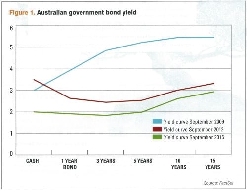
Fast forward three years to 2012 and the yield curve looks completely different. So does the world. In the intervening period the Reserve Bank has increased cash rates to as high as 4.75% in an effort to slow growth and then started reducing rates to 3.5%. The yield on a 15 year government bond has dropped more than two percentage points from 5.5% to 3.3% indicating growth for the future looks subdued. The yield curve is now inverted and negative. The fact that cash rate is higher than longer term government bonds is extremely worrying and clearly signals that the Reserve Bank will continue to cut short term interest rates.
Meanwhile the Australian Dollar has already reached its peak against the US Dollar of US$1.10 but is still worth US$1.04, 18% higher than three years previously. Crude oil has risen 70% in three years and is worth US$112 a barrel. Iron ore, meanwhile, is US$100 a tonne, down around one third in four short months but still massively higher than the long run average.
The Australian sharemarket had risen 10% in four months, and as interest rates are lowered, is about to go on a tear and add about 24% in the next 12 months.
Fast forward again to the end of September 2015. Economic prospects for the country are much more subdued, the sharemarket is down around 13% from its 2015 peak — nearly all of this in the previous two savage months. The cash rate is sitting at 2%, as it has done for five previous months, and doesn’t look like going anywhere except down for the foreseeable future. There doesn’t appear to be much risk of recession, but not a lot of economic growth in the medium future either. The iron ore price has collapsed to US$57 a metric tonne, but remains volatile. The Australian Dollar is now buying US$0.70. The yield curve has had a huge parallel shift down. It’s flat for five years and then slightly positive from 10 to 15 years. The one and three year rates are lower than cash, indicating that expectations for economic growth are very low.
[via Financial Standard]